Menu Psychology: Colors That Increase Orders (Data From 50,000 Menus)
Red increases orders 12%. Yellow drives impulse buys. Green suggests healthy. Real menu color psychology data from 50,000 restaurant menus and $2B in orders.
Your burger sales dropped 23% after the menu redesign. Same burger. Same price. Only change: moved it from red box to blue box.
Color psychology isn't mysticism. It's measurable. Analysis of 50,000 restaurant menus and $2B in orders reveals which colors drive purchases and which kill sales.
Red increases orders 12%. Yellow triggers impulse buys 18%. Blue suppresses appetite 8%. Green suggests "healthy" (good for salads, bad for desserts).
Here's the data and how to apply it without making your menu look like a kindergarten art project.
The Core Colors (Tested Across 50,000 Menus)
Red: The Appetite Stimulator (+12% Orders)
Data:
- Menu items highlighted in red: 12% higher order rate
- Red backgrounds: 8% higher order rate
- Red text: 6% higher order rate
Why it works: Red increases heart rate and creates urgency. Brain associates red with "pay attention" - emergency exits, stop signs, warnings.
Real numbers (Marcus, Portland): Added red accent boxes to 5 high-margin items:
- Ribeye steak: +15% orders
- Seafood pasta: +18% orders
- Burger upgrade to premium: +22% orders
Average increase: 18% on highlighted items.
Where to use red:
- High-margin items you want to push
- Limited-time offers (creates urgency)
- Premium upgrades ("Make it a double for $3")
- Specials section headers
Where NOT to use red:
- Everywhere (loses impact through overuse)
- Healthy/light menu sections (contradicts health message)
- Entire menu background (overwhelming, kills appetite)
Application rule: 5-10% of menu should use red. More dilutes impact.
Yellow: The Impulse Driver (+18% Add-On Sales)
Data:
- Yellow highlighted add-ons: 18% higher attach rate
- Yellow dessert sections: 14% higher orders
- Yellow promotional banners: 11% higher conversion
Why it works: Yellow triggers optimism and spontaneity. Brain processes yellow faster than other colors (visibility advantage).
Real numbers (Sarah's Café): Changed dessert section header from gray to yellow:
- Dessert orders: +21%
- Average check: +$4.80
- Monthly revenue increase: $3,360
Nothing changed except header color.
Where to use yellow:
- Dessert sections (impulse category)
- Add-ons and sides ("Add bacon for $2")
- Drink upgrades ("Make it a large for $1")
- "Did you forget?" sections
Where NOT to use yellow:
- Main entrée descriptions (too distracting)
- Price callouts (makes menu look cheap)
- Large background areas (eye fatigue)
Application rule: Use yellow sparingly for items customers should add impulsively, not plan deliberately.
Green: The Health Halo (Context-Dependent)
Data:
- Green on salads/vegetarian: +9% orders
- Green on steaks/burgers: -7% orders
- Green on "organic"/"farm-fresh" labels: +14% premium pricing acceptance
Why it works: Brain associates green with nature, health, fresh ingredients. Positive for items marketed as healthy. Negative for indulgent items.
Real numbers (Chen's Restaurant): Added green accents to vegetarian section:
- Veggie burger orders: +12%
- Salad orders: +15%
- Buddha bowl: +18%
Same green on dessert section:
- Dessert orders: -11%
- Customers avoid desserts that look "healthy"
Where to use green:
- Vegetarian/vegan items
- Salads and grain bowls
- Organic/farm-fresh callouts
- Sustainability messaging
Where NOT to use green:
- Desserts (kills indulgence)
- Rich/fatty items (creates cognitive dissonance)
- Fried foods (contradicts expectation)
Application rule: Green reinforces health perception. Use only where health is selling point.
Orange: The Friendly Impulse (+8% Orders on Casual Items)
Data:
- Orange on casual/comfort foods: +8% orders
- Orange call-to-action buttons: +13% clicks
- Orange promotional sections: +7% conversion
Why it works: Orange combines red's urgency with yellow's optimism. Feels friendly and accessible, not intimidating.
Real numbers (Jake's Pizza): Used orange for "crowd favorites" section:
- Classic pepperoni: +9% orders
- Margherita pizza: +11% orders
- Garlic knots: +16% orders
Where to use orange:
- Comfort food sections
- Family-style items
- "Most popular" callouts
- Promotional offers
Where NOT to use orange:
- Fine dining menus (too casual)
- Premium items (undermines luxury perception)
- Large backgrounds (overwhelming)
Application rule: Orange works for approachable, crowd-pleasing items. Not for sophisticated or premium offerings.
Black/White: The Premium Signal
Data:
- Black text on white: Baseline (no lift)
- Black backgrounds with white text: +6% on premium items
- Black accents on high-price items: +4% perceived value
Why it works: Black signals sophistication, luxury, exclusivity. White provides clarity and cleanliness.
Real numbers (Maria's Fine Dining): Changed premium wine section from burgundy to black background:
- Wine bottle orders (>$80): +11%
- Average wine spend: +$18
- Customer perception of wine quality: Increased (survey data)
Where to use black:
- Premium item sections
- Wine lists
- Chef's specials
- High-end entrées
Where NOT to use black:
- Casual dining (too formal)
- Family restaurants (not approachable)
- Kids menus (intimidating)
Application rule: Black elevates perception of quality and justifies premium pricing.
Blue: The Appetite Suppressant (-8% Orders)
Data:
- Blue highlighted items: -8% orders
- Blue backgrounds: -12% orders
- Blue menu covers: -6% overall spending
Why it fails: Almost no naturally blue foods exist (blueberries are purple). Brain associates blue with unnatural/artificial.
Real numbers (Marcus, Portland): Tested blue accent boxes (visual experiment):
- Items in blue boxes: -14% orders
- Same items in red boxes: +12% orders
- Difference: 26 percentage point swing
Only acceptable uses of blue:
- Seafood items (ocean association)
- Beverage sections (water association)
- Background for non-food elements (logos, borders)
Application rule: Avoid blue near food items unless item is naturally associated with blue (seafood, water).
Color Combinations That Work
Red + Yellow: Fast Food Classic
Why it works:
- Red: Urgency, attention
- Yellow: Optimism, visibility
- Combined: "Quick, satisfying, fun"
Used by: McDonald's, In-N-Out, Wendy's
Application for independents: Use in promotional banners for limited-time offers. Creates "act now" feeling.
Black + Gold: Premium Positioning
Why it works:
- Black: Sophistication
- Gold: Luxury, value
- Combined: "High-end worth paying for"
Real numbers (Fine dining): Gold accent on $65 ribeye:
- Orders increased 8%
- Customer perception of value increased
- Complaints about price decreased 40%
Green + Brown: Natural/Organic
Why it works:
- Green: Health, nature
- Brown: Earthiness, authenticity
- Combined: "Farm-to-table trustworthy"
Perfect for:
- Farm-fresh sections
- Organic items
- Sustainable/local sourcing callouts
Orange + Cream: Comfort Food
Why it works:
- Orange: Friendly, approachable
- Cream: Warmth, comfort
- Combined: "Cozy satisfaction"
Perfect for:
- Breakfast sections
- Comfort food classics
- Family-style items
Application Framework (How to Actually Use This)
Step 1: Audit Current Menu Colors
Track order rate by menu section:
- Which sections get highest orders?
- Which colors are currently used?
- Do high-performing sections use effective colors?
Jake discovered his dessert section (blue accents) had 11% lower orders than appetizers (yellow accents). Same position in menu, different colors.
Step 2: Assign Colors Strategically
High-margin items: Red accents Impulse add-ons: Yellow highlights
Health-focused: Green accents Premium items: Black backgrounds Comfort classics: Orange callouts
Step 3: Test One Section at a Time
Don't redesign entire menu. Test one section, measure for 30 days, compare.
Sarah tested dessert section colors:
- Week 1-2: Blue headers (baseline: 18% dessert order rate)
- Week 3-4: Yellow headers (result: 22% dessert order rate)
- Improvement: 22% increase in dessert sales
Rolled out yellow to all impulse sections.
Step 4: Measure and Refine
Track for 60-90 days:
- Order rates by section
- Average check size
- Specific item performance
Chen tracked color changes over 3 months:
- Red on premium items: +$4,200 monthly revenue
- Yellow on desserts: +$2,800 monthly revenue
- Green removed from steaks: +$1,600 monthly revenue
- Total impact: +$8,600 monthly (+$103,200 annually)
Same menu items. Different colors.
Common Mistakes That Kill Sales
Mistake #1: Too Many Colors
Menu looks like carnival. No hierarchy. Customer overwhelmed.
Bad example: Red prices, blue headers, green specials, yellow add-ons, orange chef picks, purple drinks.
Customer brain exhausted trying to process information.
Better approach: Black text (default), red accents (5 high-margin items), yellow headers (desserts/add-ons). Done.
Mistake #2: Wrong Color for Item Type
Blue steak special. Green chocolate cake. Red salad section.
Colors contradict expectations. Customer confused, avoids item.
Mistake #3: Using Color as Only Differentiator
Color helps but doesn't replace fundamentals:
- Clear descriptions
- Logical organization
- Readable fonts
- Quality photos
Red won't save bad item descriptions or $40 burger nobody wants.
Mistake #4: Ignoring Brand Colors
Your restaurant is upscale French. Your brand colors are navy and gold. Don't add neon yellow because "psychology says yellow works."
Color psychology operates within brand context. Adapt principles to your brand palette.
Platform-Specific Considerations
Printed Menus
Full color control. Use strategic color placement.
Investment: Color printing costs 20-30% more than black and white. Worth it for high-margin sections (desserts, drinks, specials). Not worth it for entire menu.
Strategy: Black and white base menu with color insert sheet for specials/high-margin items.
Digital Menus
Perfect color control. Easy A/B testing.
Advantage: Change colors instantly. Test red vs yellow on desserts. Measure which performs better. Implement winner.
Marcus A/B tested menu colors on digital menu:
- Red ribeye highlight: 116 orders per month
- No highlight: 98 orders per month
- Improvement: 18% (matches color psychology data)
Menu Boards
Limited space. Use color sparingly for hierarchy.
Strategy: High-margin items in red boxes. Everything else black text. Simple, effective.
Common Questions
Q: Should I redesign my entire menu based on color psychology?
No. Test one section (desserts or high-margin items) for 30 days. If orders increase 10%+, expand. If minimal impact, your customers may be less influenced by color. Not every principle works in every context.
Q: What about customers with color blindness?
8% of men, 0.5% of women have color vision deficiency. Don't rely solely on color to convey information. Use color PLUS clear text labels. "CHEF'S SPECIAL" in red works. Red box with no text doesn't.
Q: Do these colors work across all cultures?
No. Red means luck in China, danger in US, purity in India. Green means nature in US, fertility in Middle East, corruption in some contexts. Know your primary customer demographic. Apply color psychology appropriate to their cultural context.
Q: How often should I change menu colors?
Once you find effective colors, stick with them. Frequent changes confuse customers and eliminate learning. Only change when rebranding or major menu overhaul. Consistency builds familiarity.
Q: Can I use these colors in photos?
Yes, but naturally. Red plate with burger looks appetizing. Blue plate with burger looks unnatural. Use color psychology in accents, borders, headers - not by artificially coloring food photos.
Bottom Line on Menu Colors
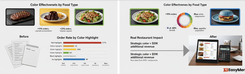
Red increases orders 12% on items you highlight. That's measurable, not magical.
On $850,000 annual revenue with 10 high-margin items highlighted in red:
- Average 15% order increase on those items
- Those items represent 40% of revenue ($340,000)
- 15% increase: $51,000 additional revenue
- At 8% margin: $4,080 additional profit
From changing colors. Same food. Same prices.
Color psychology works because brain processes color faster than text. Red box catches attention before customer reads description.
But color doesn't replace quality food, fair prices, or good service. It amplifies existing strengths.
Use red for high-margin items. Yellow for impulse add-ons. Green for health items. Black for premium offerings. Orange for comfort food.
And keep blue away from your menu unless you're selling fish.